A Stroke of Genius!
September 20th, 2010
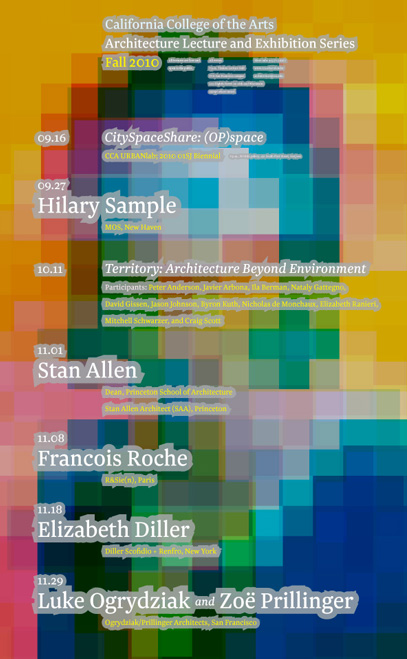
Bob Aufuldish of Aufuldish & Warinner recently “confessed” to me that in a recent poster he designed, he broke one of the cardinal rules of typography in the digital age: never put a stroke on the type. But in this instance, he used this feature to create a very dramatic technique which serves to highlight the text. “I’ve made the strokes so thick that they act as a field to separate the type from the underlying image,” Bob explains. I think he should be declared “not guilty”, don’t you?
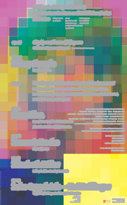
This is the back of the poster:


Leave a Reply