
Articles&Blog
12 Typographic New Year’s Resolutions
December 31st, 2016
The coming of a new year is a great time to take stock of our professional lives, pat ourselves on the back for work well done, and resolve to do even better next year. It is also the perfect time to […]
The 10 Commandments of Email Etiquette
August 17th, 2015
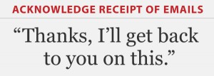
Gone are the days when we relied upon the telephone and the mail service for most communications. Today’s digital world relies heavily on email to make things happen in the world of business and commerce. There are many unspoken guidelines […]
Single or Double Spaces Between Sentences?
May 19th, 2015
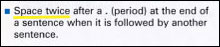
Should you put one word space between sentences or two? This question continues to be hotly debated between people in personal, professional, and educational settings, as well as in blogs, newspapers, online news resources, and even dinner parties! But for […]
How Good Typography Can Help Your Job Search
May 12th, 2015

Karl Heine, principal and solutionist of creativeplacement with offices in CT and NY, knows what it takes for creatives to nab that perfect job. After all, he has been placing creative talent for over 25 years, with many extremely satisfied clients and […]
Eight Timeless Typefaces
January 27th, 2015

Fonts that are in vogue come and go, with popular typestyles constantly being replaced by newer, trendier designs. But even with the hundreds of new typefaces being released each year, there are some that don’t seem to age, and continue […]
Designing For the Aging Eye
December 11th, 2014

As we age, our eyes and vision change, making it more difficult to read – and for some, to perceive color and contrast. If your audience includes seniors, there are some important recommendations to take into consideration in order to […]
Open Source Fonts
November 26th, 2014
Open source fonts are more than just free fonts – they are part of a movement, or a philosophy if you will, that strives towards making quality fonts freely available for both personal and professional use. Some are totally freeware, […]
Free Fonts: Are They Worth It or Not?
November 13th, 2014
One of the most frequent questions I am asked by students and designers alike is, is it worth it to buy fonts when there are so many free fonts available? Having worked with dozens of typeface designers during my years as […]
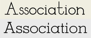
The Anatomy of a Character
August 25th, 2014
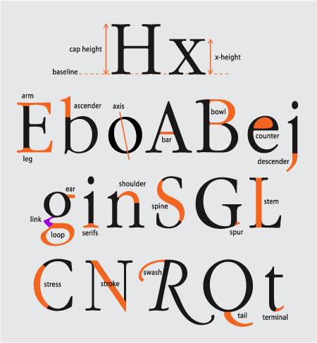
Knowing the terminology for the anatomy of a character might seem like a painful exercise in memorization, but it’s actually useful knowledge for any design professional. Not only does it make it easier to communicate about typefaces and their characteristics, […]
Typographic Checklist
March 26th, 2013

I always recommend that designers and students make a typographic checklist to help avoid committing type crimes, as well as to aid in finessing their typography. At long last, I finally created a checklist that covers issues I’m most frequently […]