
Category Archives: fy(t)i
Typographic Checklist
March 26th, 2013

I always recommend that designers and students make a typographic checklist to help avoid committing type crimes, as well as to aid in finessing their typography. At long last, I finally created a checklist that covers issues I’m most frequently […]
The Story Behind Comic Sans
February 28th, 2013
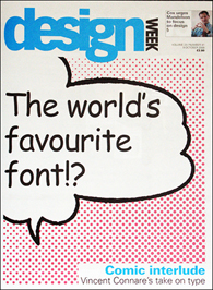
OK, I admit it, I’ve added to the glut of articles on Comic Sans. But if you know me, you know I am not into font bashing — I’m kinda like the “Switzerland” of type. So check out this interview […]
The Story Behind Zapf Chancery
April 21st, 2011

The ITC Zapf Chancery® typeface has been seen by just about everyone who uses a personal computer. In particular, one member of the family – Medium Italic – has been selected (or not) by millions of designers and non-designers alike. […]
Missing Font Mysteries – Solved At Last!
March 9th, 2011
Have you ever experienced the frustration of opening an existing document and being confronted with a prompt for a “missing font” that you have not used in the document? Or, have you on occasion found unused fonts listed in the […]
Arial vs. Helvetica
October 22nd, 2010
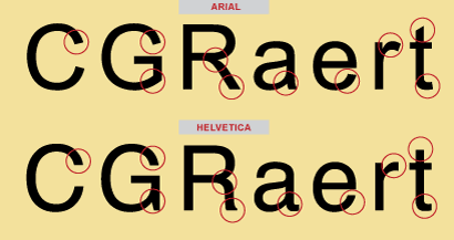
We’ve all heard of the Arial® and Helvetica® typefaces, and have most likely used them both. Graphic designers either love or hate the designs. What’s the story behind these two polarizing typeface designs? Here’s the scoop! The Helvetica Story Helvetica […]
Scaling Logos
September 15th, 2010

When it comes to logos, one size doesn’t necessarily fit all — usages, that is. A frequently neglected aspect of designing a typographic logo is the potential need for slightly different versions for use at different sizes and in various […]