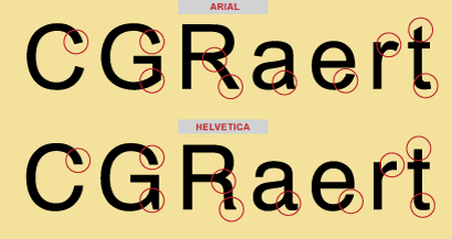
Arial vs. Helvetica
October 22nd, 2010
We’ve all heard of the Arial® and Helvetica® typefaces, and have most likely used them both. Graphic designers either love or hate the designs. What’s the story behind these two polarizing typeface designs? Here’s the scoop!
The Helvetica Story
Helvetica was originally designed in 1957 by Swiss typeface designer Max Miedinger for the Haas Type Foundry in Switzerland. His objective was to create a neutral, legible sans serif typeface that could compete with the Akzidenz Grotesk® typeface – and could be used in a broad variety of applications. Its original name, Neue Haas Grotesk, reflects this heritage. When Haas became part of the Linotype group of companies, the name was changed to Helvetica (an adaptation of “Helvetia”, the Latin name for Switzerland). Linotype added more weights and began heavily promoting the family. Helvetica has since gone on to become one of the most well-known and widely used typefaces in the world.
In the mid 1980s, Helvetica virtually became a household name when it, along with Times Roman® and Courier, were made core fonts in Apple® Computer’s operating system and laser printers — ushering in desktop publishing. Read on…


Leave a Reply