Typographic Checklist
March 26th, 2013
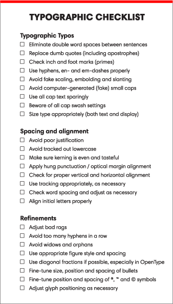
 I always recommend that designers and students make a typographic checklist to help avoid committing type crimes, as well as to aid in finessing their typography. At long last, I finally created a checklist that covers issues I’m most frequently asked about in my workshops. You can download the PDF and print it out. You can also click on the links to learn more, as I’ve previously published columns dedicated to most of these topics. You may find it useful to customize your own checklist from the topics below for a specific client or project.
Typographic Typos
Steer clear of these common type crimes:
☐ Eliminate double word spaces between sentences
☐ Replace dumb quotes (including apostrophes)
☐ Check inch and foot marks (primes)
☐ Use hyphens, en- and em-dashes properly
☐ Avoid fake scaling, embolding and slanting
☐ Avoid computer-generated (fake) small caps
☐ Use all cap text sparingly
☐ Beware of all cap swash settings
☐ Size type appropriately (both text and display)
Spacing and alignment
Good visual balance and alignment contribute greatly to professionally set typography.
☐ Avoid poor justification
☐ Avoid tracked out lowercase
☐ Make sure kerning is even and tasteful
☐ Apply hung punctuation / optical margin alignment
☐ Check for proper vertical and horizontal alignment
☐ Use tracking appropriately, as necessary
☐ Check for appropriate word spacing and adjust as necessary
☐ Align initial letters properly
Refinements
The devil is in the details, so use these points as a guide to first-rate typography:
☐ Adjust bad rags
☐ Avoid too many hyphens in a row
☐ Avoid widows and orphans
☐ Use appropriate figure style and spacing
☐ Use diagonal fractions if possible, especially in OpenType
☐ Fine-tune size, position and spacing of bullets
☐ Fine-tune position and spacing of ®, ™ and © symbols
☐ Adjust glyph positioning as necessary


Leave a Reply