
Blog Archives
← OLDER POSTS
Open Source Fonts
November 26th, 2014
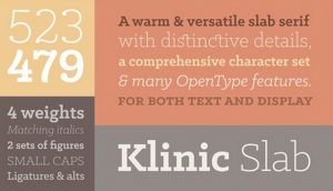
Open source fonts are more than just free fonts – they are part of a movement, or a philosophy if you will, that strives towards making quality fonts freely available for both personal and professional use. Some are totally freeware, […]
Free Fonts: Are They Worth It or Not?
November 13th, 2014
One of the most frequent questions I am asked by students and designers alike is, is it worth it to buy fonts when there are so many free fonts available? Having worked with dozens of typeface designers during my years as […]
Which Flavor of OpenType Is Best?
April 20th, 2011
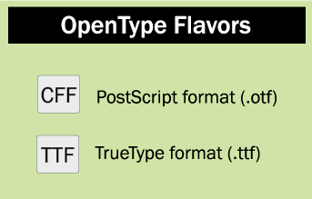
Lot’s of lively comments on this one… Q. What’s the difference between the TTF and CFF OpenType formats? A. OpenType fonts come in two flavors with two different extensions: CFF, which usually has the extension .otf (often referred to as […]
Missing Font Mysteries – Solved At Last!
March 9th, 2011
Have you ever experienced the frustration of opening an existing document and being confronted with a prompt for a “missing font” that you have not used in the document? Or, have you on occasion found unused fonts listed in the […]
Space Invaders: Why you should never, ever use two spaces after a period.
January 16th, 2011
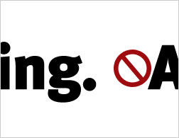
“Two-spacers are everywhere, their ugly error crossing every social boundary of class, education, and taste. You’d expect, for instance, that anyone savvy enough to read Slate would know the proper rules of typing, but you’d be wrong; every third e-mail […]
Arial vs. Helvetica
October 22nd, 2010
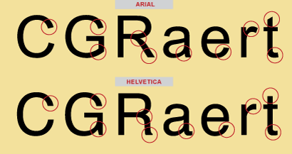
We’ve all heard of the Arial® and Helvetica® typefaces, and have most likely used them both. Graphic designers either love or hate the designs. What’s the story behind these two polarizing typeface designs? Here’s the scoop! The Helvetica Story Helvetica […]
A Stroke of Genius!
September 20th, 2010
Bob Aufuldish of Aufuldish & Warinner recently “confessed” to me that in a recent poster he designed, he broke one of the cardinal rules of typography in the digital age: never put a stroke on the type. But in this […]
Scaling Logos
September 15th, 2010

When it comes to logos, one size doesn’t necessarily fit all — usages, that is. A frequently neglected aspect of designing a typographic logo is the potential need for slightly different versions for use at different sizes and in various […]
Archives
September 12th, 2010

Back issues of All Things Typographic: August 2017 June 2017 April 2017 February–March 2017 January 2017 December 2016 November 2016 October 2016 September 2016 August 2016 July 2016 May 2016 April 2016 March 2016 February 2016 January 2016 November 2015 October 2015 […]